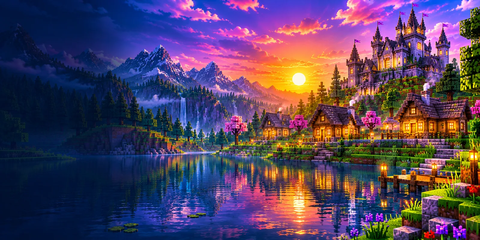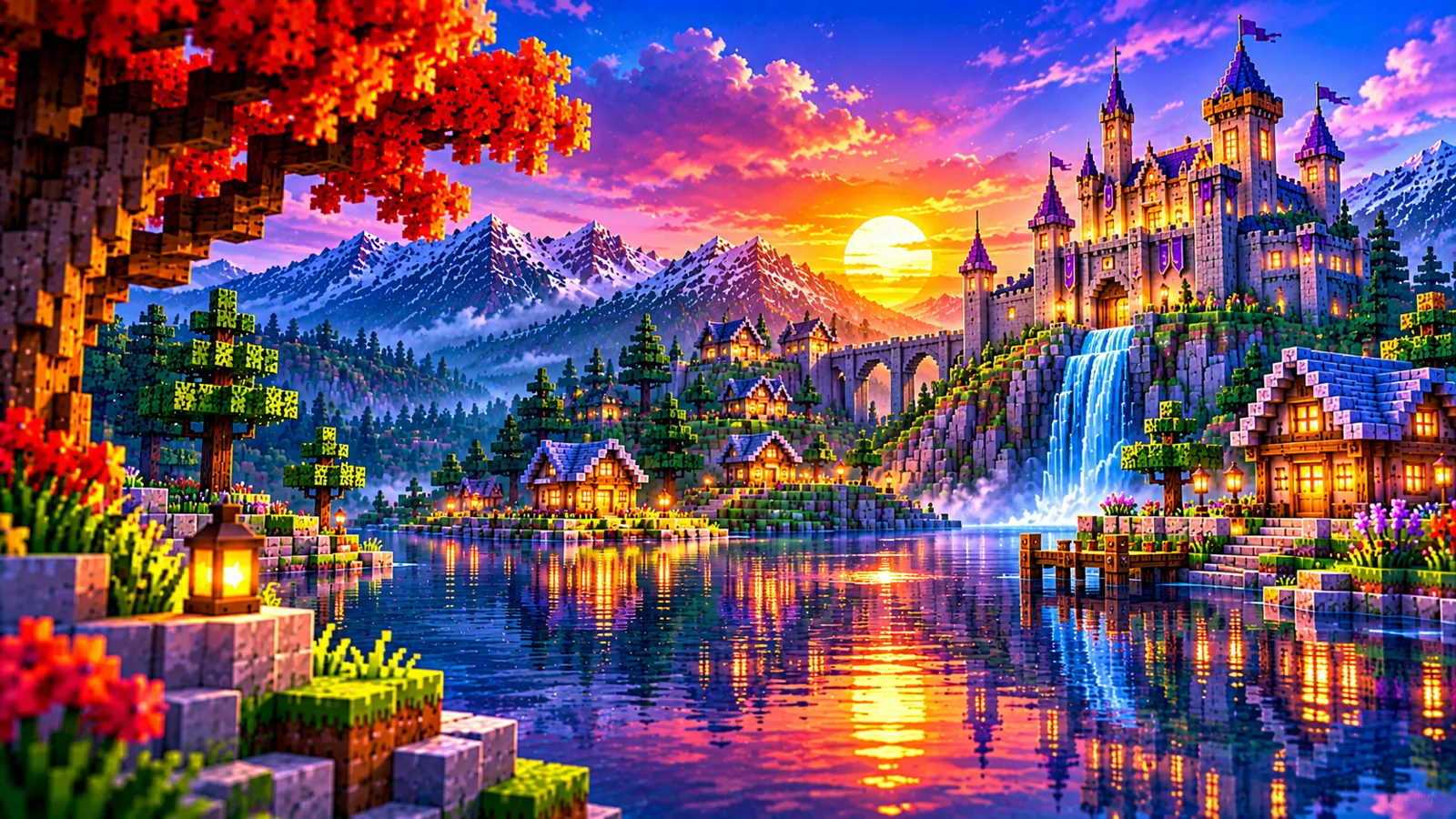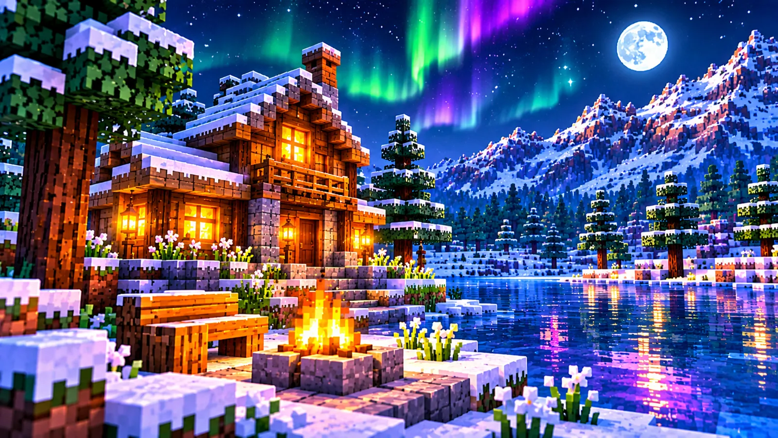
Complementary Shaders Visual Style Settings Explained

Unbound and Reimagined are two base looks built on one settings system. That shared system is powerful: it means the dials you learn in one style work identically in the other, and it lets you bend a style part-way toward its sibling. This guide explains how the visual style settings are organised, which groups define each style's identity, and how far customisation can, and cannot, take you.
One system, two starting points
When you open the pack's settings screen (from the shader menu, once a pack is selected), both styles present the same structure: a profile selector (Potato through Ultra) and groups of options covering lighting, shadows, water, sky and atmosphere, and quality. What differs between the styles is the underlying rendering design, the way light is modelled and graded, which the settings then modulate. Think of the styles as two different cameras, and the settings as the lenses and exposure controls both cameras share.
The settings that define a style
- Lighting behaviour and colour. The warmth, contrast and grading of light is the deepest style signature. Settings here shift emphasis; they do not swap the model.
- Sky and atmosphere. Cloud character, fog density and atmospheric depth carry much of Unbound's cinematic identity and Reimagined's cleanliness. See clouds, fog and atmosphere settings.
- Water. Reflection strength, colour and wave character, a strong style marker, tuned in water and reflection settings.
- Shadow character. Softness and depth of shadows, detailed in lighting and shadow settings.
Pushing one style toward the other
Practical examples of what adjustment can do:
- Unbound, but friendlier at night: raise the relevant brightness/lighting options modestly and soften atmosphere. You keep the cinematic days and gain playable nights.
- Reimagined, but moodier: deepen atmosphere and fog, warm the lighting, strengthen water reflections. You approach Unbound's mood while keeping Reimagined's clarity underneath.
- Either, but cheaper: the profile and quality dials change cost, not identity. Style survives at Potato; it just renders more simply.
The limit is real, though: settings modulate a design, they do not replace it. If you push every dial toward the other style and still feel the difference, you will, that difference is the base look, and the correct fix is the other ZIP, which costs nothing and keeps its own settings. Switching is painless by design.
A sensible customisation workflow
- Start from a profile that performs well (presets explained).
- Change one group at a time, lighting first, then water, then atmosphere, in the same test scene.
- Play an in-game day with each change before judging it; shader looks are time-of-day dependent.
- Write down what you changed. Your settings file is saved automatically per style, but a note survives updates, see keeping settings across updates.
Reading the setting groups as style dials
It helps to read each group by the question it answers. The lighting group answers "how does light behave in my world?", its warmth, contrast and brightness decide whether a scene feels golden and dramatic or open and even, and it is the group to touch first when a style feels too dark or too flat. The shadow part of the system answers "how solid does the world feel?" Stronger, deeper shadows ground buildings and terrain; softer treatment keeps shaded areas readable for work. Changing shadows changes mood less than lighting does, but it changes usability a great deal, especially inside your own builds.
The water group answers "what kind of place is this?" Reflective, sky-matched water pulls a world toward realism and makes coasts and lakes into scenery; clearer, brighter water keeps them friendly and game-like, and suits worlds where water is a building material as much as a view. The clouds, fog and atmosphere group answers "how big does the world feel?" More atmosphere means more depth, more weather and more drama at distance, and less clarity at that same distance. The quality and profile controls answer a different question entirely: "how much can my computer afford?" They simplify or enrich the rendering without changing which style you are in, which is why a style keeps its identity even at the Potato end of the ladder.
Reading the groups this way prevents the most common tuning mistake: reaching for the quality dials to fix a mood problem, or for the atmosphere dials to fix a performance problem. Mood lives in lighting, water and atmosphere. Readability lives in lighting and shadows. Cost lives in the profile and quality groups. Adjust the group that owns the problem.
Three example tuning projects
Project one: Unbound you can build in. Start from Unbound's default and a profile your computer handles comfortably. Lift the darker areas modestly through the lighting options, and ease the atmosphere back a step so nearby work stays clear while distance keeps its depth. Leave the water alone, it is rarely the problem. The result keeps Unbound's golden hours and reflective coasts, but a half-finished build at dusk is something you can still work on. Judge it inside a real interior, not outdoors: interiors are where this project succeeds or fails.
Project two: Reimagined with an evening mood. Start from Reimagined's default. Warm and deepen the lighting a little, add atmosphere and fog gradually, and strengthen the water reflections. Stop earlier than you think you should: Reimagined's clarity is the asset you are spending, and the goal is a world that feels richer at sunset while remaining unmistakably readable at noon. This project suits players who mostly play in the daytime but want their screenshots and evening sessions to carry more atmosphere.
Project three: one style, two purposes. Pick the style nearest your everyday taste and tune it for daily play only. Resist tuning it for screenshots as well, that path leads to constant adjustment. Instead, keep the other style installed with its own settings tuned purely for photography or scenery, and switch when the purpose changes. Because each style stores its own settings file, this is not a compromise but a division of labour, and it is the setup most long-term players end up with. The switching routine is in switching between styles.
When to stop tuning and switch styles
Tuning has a natural stopping point: when every change improves one hour of the day and worsens another, you have reached the limit of what settings can do, and the remaining difference is the base design. Other signs are just as clear. If you have pushed all three mood groups, lighting, water and atmosphere, toward the other style and still prefer the other style's default screenshots, you do not have a settings problem; you have chosen the wrong starting point. If you keep a written list of changes you re-apply after every session, the style is fighting you.
Switching is not an admission of failure, and it costs nothing: both styles are separate ZIPs of about half a megabyte, they release together at the same version, and your tuned settings for the first style stay saved in its own file if you ever return. Many players treat the first style as a draft, it taught them which dials matter and what they actually value, and arrive at the second style already knowing how to tune it. That knowledge transfers completely, because the system is shared; only the starting point changes. For a structured comparison before you decide, revisit the Unbound vs Reimagined comparison with your tuning notes beside it.
Frequently asked questions
Are the settings screens identical in both styles?
Structurally yes, same groups, same organisation. Defaults and the underlying rendering differ, which is why the same numbers can look different per style.
Can I copy my settings file from Unbound to Reimagined?
The files are per-style for a reason: each style stores values against its own design. The loader keeps them separate automatically; enjoy that each style remembers its own look instead of fighting it.
Where do I start if the menus overwhelm me?
The best settings guide gives an ordered route: profile first, then the three or four options that visibly matter.